Some example plots and other output from my projects
Some example output from my polling.py code, which aggregates polling data into a running average.
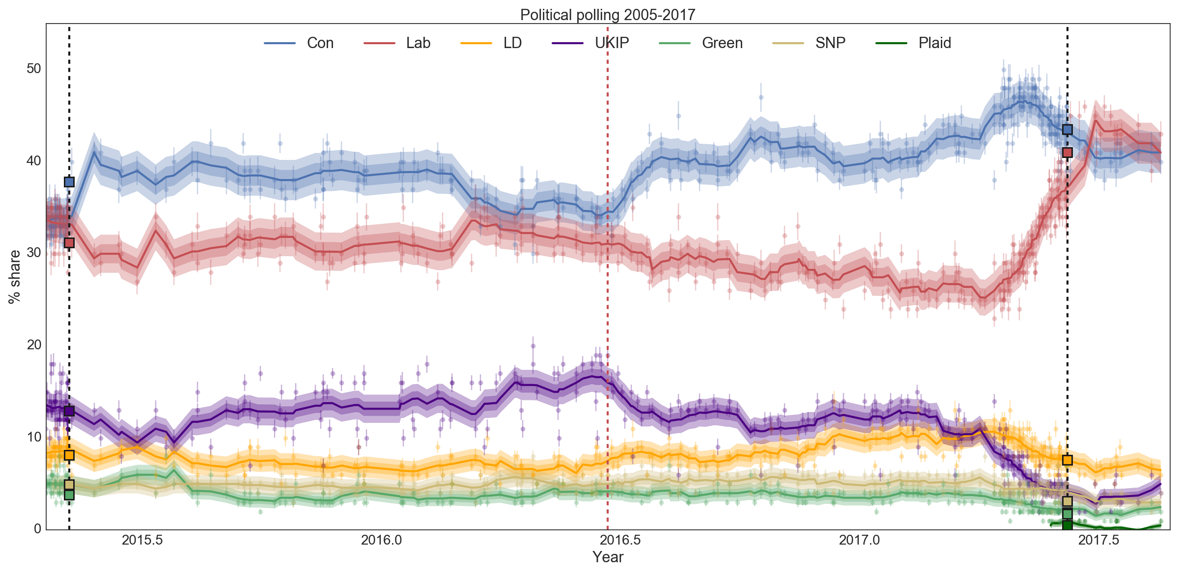
In this case, the x-axis has been restricted to run from just before the 2015 general election to the end of August 2017. The black vertical lines are the general elections that took place, and the red vertical line marks the EU referendum. The legend describes the colours for each party, and I show both their actual results (squares), all polling results (circles with error bars showing the 95% credible interval), and a running average with a two-week window. Treating this average as a model for the true state of public opinion at any time, I also plot the 68% and 95% credible intervals around this. If the model is any good, 95% of polls ought to lie within the wider band. This isn't always true - which tells you that there are significant systematic differences in the results reported by different pollsters.
A new project: using scikit-learn to model the EU referendum result by constituency via demographic and electoral data. So far it's early days, but I've been able to use Lasso regression to create a linear model that generalises fairly well when you split the data into a training set and a test set.
Shown above: an interactive plot made with Bokeh, showing the randomly split training set and test set and how the model prediction compares with the estimate
of the